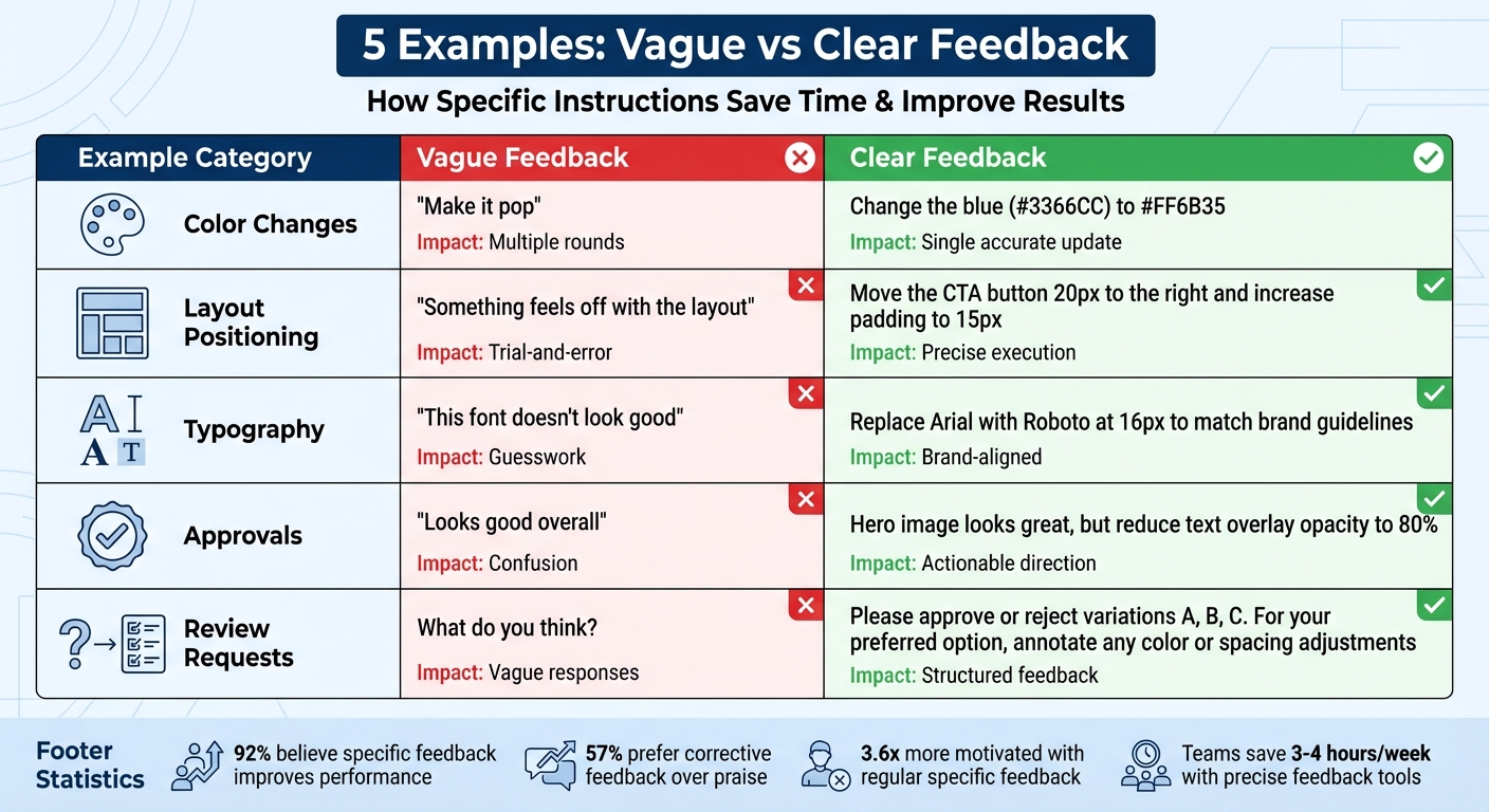
5 Examples Of Clear vs Useless Feedback
Ever been stuck trying to decode vague feedback like "make it pop"? It’s frustrating and wastes time. The key to effective feedback is clarity: specific, actionable, and tied to context. This article compares common vague feedback with precise alternatives to show how clear instructions can save time, improve outcomes, and simplify collaboration.
Key Takeaways:
- Vague Feedback: Generic phrases like "something feels off" leave teams guessing.
- Clear Feedback: Specific details like "move the CTA button 20px to the right" eliminate confusion.
- Examples Covered: Color changes, layout tweaks, typography adjustments, structured approvals, and actionable requests.
Quick Tip: Tools like BoastImage let clients directly annotate designs, cutting through ambiguity and streamlining revisions.
Let’s break down five examples where clear feedback outshines vague comments.
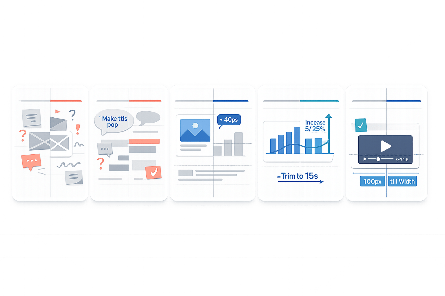
Vague vs Clear Feedback: 5 Examples Comparison Chart
How to Give Better Design Feedback
sbb-itb-32f6eb2
Example 1: "Make It Pop" vs Specific Color Changes
"Make it pop." If you're a designer, you've probably heard this phrase more times than you can count. While it might sound like helpful feedback, it’s anything but. The problem? It’s vague. This kind of direction leaves too much open to interpretation, forcing designers to guess what the client actually means. The result? Unnecessary back-and-forth and a lot of wasted time.
Now, compare that to feedback like this: "Change the blue (#3366CC) to #FF6B35." See the difference? This specific instruction tells the designer exactly what needs to be done - no guesswork involved. It identifies the element, the current color, and the desired color. With clear guidance like this, revisions become straightforward and efficient.
The difference in time spent on revisions is huge. Vague feedback like "make it pop" often sends designers down a rabbit hole, trying out multiple options in the hope of landing on what the client wants. On the other hand, precise feedback allows designers to make the right changes the first time, cutting down on unnecessary revisions and frustration.
When feedback includes measurable details - like hex codes, pixel dimensions, or specific element names - it creates actionable tasks that can be completed quickly. This leads to faster project completion, less confusion, and designs that align perfectly with the client’s vision.
How Precision Affects Revision Time
The value of specific feedback becomes even clearer when you compare the outcomes side by side:
| Feedback Type | Example Statement | Impact on Revision Time | Outcome |
|---|---|---|---|
| Vague | "Make it pop" | High (Multiple rounds of guessing) | Confusion, delays, and frustration |
| Precise | "Change the blue (#3366CC) to #FF6B35" | Low (Single, accurate update) | Quick turnaround and clear goal alignment |
Modern feedback tools make this process even smoother. For example, platforms like BoastImage allow clients to click directly on a design element and leave context-specific comments. This eliminates ambiguity entirely, reducing revision cycles and streamlining collaboration. Precise instructions are the key to faster workflows and better results.
Example 2: "Something Feels Off" vs Exact Positioning Instructions
Let’s dive into how precision can transform layout adjustments. Imagine someone saying, "Something feels off with the layout." Sure, it flags an issue, but it leaves the team guessing. Is it the spacing? The alignment? The color balance? Without specifics, this kind of feedback often leads to trial-and-error fixes and multiple revisions.
Now compare that to a comment like, "Move the CTA button 20px to the right and increase the padding to 15px." This version is crystal clear. It tells you what to adjust, where to move it, and even provides exact measurements. No guesswork, no wasted time.
Leah Messenger sums it up perfectly: "Generic comments like 'change this' offer no guidance, while specific feedback pinpoints improvements". Beyond clarity, the tone of feedback matters too. Vague comments can feel discouraging, even demoralizing. On the other hand, specific instructions focus attention on actionable changes, making the process more constructive and efficient. It’s no surprise that 92% of people believe specific, well-delivered negative feedback is effective for improving performance.
How Specific Feedback Reduces Revision Cycles
The impact of precise feedback goes beyond just saving time - it changes how teams work. For example, some teams report saving 3 to 4 hours per week by using tools that capture technical details like browser information and CSS selectors. This is especially important when vague feedback turns out to be caused by environment-specific bugs, such as issues that only appear on certain browsers or screen resolutions. Tools that automatically include this context allow developers to replicate and solve problems quickly, cutting down on endless back-and-forth communication.
The numbers back this up: employees who receive regular, specific feedback are 3.6 times more likely to feel motivated to excel, and 57% prefer knowing exactly how to improve rather than receiving generic praise.
Visual feedback platforms like BoastImage make this process even smoother. These tools let clients click directly on design elements to leave precise annotations. By tying feedback to the visual context, every comment becomes actionable, helping teams avoid delays and keep projects moving forward efficiently.
Example 3: "This Font Doesn't Look Good" vs Brand-Aligned Typography Notes
Let’s talk typography feedback. It’s easy to fall into the trap of vague comments like, "This font doesn't look good." While it shares dissatisfaction, it doesn’t give the designer much to work with. Questions like, "Is the font too formal? Too casual? Too small?" are left unanswered, leading to guesswork, multiple revisions, and wasted time.
Now, compare that to feedback like: "Replace Arial with Roboto at 16px to match our brand guidelines." This is clear and actionable. It identifies the problem (Arial isn’t on-brand), suggests a solution (switch to Roboto), and even specifies the size (16px). With this level of detail, the designer can make the change immediately, no back-and-forth required. Objective instructions like these not only save time but also ensure the design stays aligned with brand standards.
The key difference here? Moving from subjective opinions to actionable guidance. Instead of vague statements like "it doesn’t feel right", effective feedback ties typography changes directly to brand guidelines. And here’s an interesting stat: 57% of employees prefer corrective feedback that helps them improve over simple praise.
Using Visual Tools to Eliminate Ambiguity
When it comes to typography reviews, visual annotations can be a game-changer. Instead of drafting long emails to describe which text needs tweaking, clients can simply annotate directly on the design. For example, clicking on a headline and leaving a note like, "Switch to Roboto Bold, 18px," makes the required change crystal clear.
Tools like BoastImage make this process even smoother. Clients don’t need to sign up or log in - just click a shared link, add comments directly on the design, and they’re done. Meanwhile, design teams can take advantage of features like version control and Kanban boards to track typography changes and progress. This approach not only keeps projects on track but also eliminates the frustrations of unclear feedback or technical hurdles. It’s a win-win for everyone involved.
Example 4: "Looks Good Overall" vs Approval with Specific Adjustments
Ever get feedback like, "Looks good overall"? While it sounds encouraging, it’s often a designer’s worst nightmare. What does "overall" mean? Are there hidden issues lurking beneath the surface, or is it a green light to move forward? Without clarification, this vague response leaves designers guessing - and usually leads to follow-up emails like, "So... are we good to proceed?"
Now, compare that to feedback like: "The hero image looks great, but reduce the text overlay opacity to 80%." This is gold. It tells the designer two things: what’s working (the hero image) and what needs tweaking (opacity). It’s clear, actionable, and eliminates guesswork. The designer can jump straight into revisions without unnecessary back-and-forth.
Why does this matter? General feedback often causes confusion, delays, and even frustration. Without direction, creators can end up pursuing ideas that don’t align with the project’s goals. Worse, vague input sometimes gets ignored altogether because it’s just too ambiguous to act on.
In fact, research shows that 92% of people believe well-delivered negative feedback boosts performance, making employees 3.6 times more motivated. As Bill Gates famously said:
"We all need people who give us feedback. That's how we improve."
How Detailed Feedback Improves Collaboration
Specific feedback isn’t just helpful - it’s a game changer. When clients pinpoint exactly what needs adjusting, teams can tackle those changes in one revision cycle, managing client revision requests to save time and reduce frustration.
Tools like visual annotation platforms make this process even easier. Instead of writing a lengthy email like, "The text overlay feels too dark," clients can simply click on the hero image and leave a comment: "Reduce opacity to 80%." Platforms like BoastImage simplify this by letting clients provide feedback without creating accounts or dealing with complicated software. They just click, comment, and submit. Meanwhile, teams can track changes with version control and tools like Kanban boards, ensuring nothing slips through the cracks.
The takeaway? Clear, actionable feedback isn’t just polite - it’s the secret to smoother, faster design revisions.
Example 5: "What Do You Think?" vs Structured Approval Requests
Asking "What do you think?" when sending a design might feel approachable, but it often leads to vague responses. Clients might reply with comments like "It's nice" or "I'm not sure," which don’t provide much direction. A more structured approach clears up this ambiguity and guides clients to give actionable feedback.
Take this example of a structured request: "Please approve or reject variations A, B, and C. For your preferred option, annotate any color or spacing adjustments needed." This method sets clear expectations. Clients know exactly what you need, which details to focus on, and how to respond. The result? Feedback that’s specific and helps move the project forward.
Research supports this approach - employees are 30% more likely to act on feedback when it’s clear and actionable. By structuring approval requests, you’re not just staying organized; you’re making it easier for clients to provide meaningful input. Andy Sparks, Co-founder & CEO of Holloway, sums it up well:
"Useful feedback is when there is at least one thing the recipient of that feedback can act on to address the issue."
How Structure Improves Response Quality
Structured requests don’t just enhance the quality of feedback - they also speed up the review process. When clients know exactly what decisions they need to make, response times improve, and revision cycles are shorter. In fact, managers who provide well-structured feedback receive higher performance ratings, averaging 8.6 out of 10.
Tools like visual feedback platforms make this process even smoother. For example, BoastImage organizes client responses with Kanban boards, while clients can simply click, comment, and approve - no account setup needed. The structure is handled behind the scenes, making the process seamless for clients. By combining clear requests with tools that simplify feedback, you can turn what was once a bottleneck into a streamlined, efficient workflow.
Key Takeaways for Better Visual Reviews
Effective feedback should be clear, specific, and actionable. Instead of vague phrases like "make it pop", helpful feedback identifies the exact element that needs attention and explains the reasoning behind the change. Research shows that actionable feedback is far more effective than generic comments.
To keep projects on track, try standardizing your revision process. A three-round revision limit - focusing on strategy, layout, and final tweaks - helps manage expectations and prevents scope creep. Assigning a single point of contact on the client side to consolidate feedback ensures consistency, avoids conflicting instructions, and protects both timelines and relationships. This structure not only simplifies workflows but also fosters better communication.
Visual tools can take feedback to the next level by making the review process more intuitive. Features like visual annotations allow clients to comment directly on specific design elements. For example, platforms like BoastImage let clients click on a link and provide feedback without requiring a login. This eliminates confusion about which part of the design needs adjustment. On the backend, teams benefit from tools like version control and Kanban boards to track every requested change, while keeping the client interface simple and user-friendly. By removing ambiguity, visual annotations make feedback clearer and more efficient.
Streamlined feedback processes don't just save time - they also boost motivation and satisfaction. Regular feedback has a measurable impact: employees who receive consistent feedback are 3.6 times more likely to be motivated to excel, and engagement improves by 39% with regular input. As Bill Gates famously said, actionable feedback is essential for improvement. The key is to ensure feedback is specific, easy to track, and simple enough for clients to embrace, avoiding the chaos of scattered email threads.
FAQs
What details make feedback actionable?
Actionable feedback works best when it’s clear, specific, and focused on solutions. Instead of vague remarks, it highlights concrete areas for improvement. For example, saying, "Increase the contrast in the header to improve readability" or "Slightly reduce the font size to balance the layout" gives clear direction.
Breaking feedback into distinct, easy-to-follow points can also make a big difference. This structure helps ensure suggestions turn into real, measurable changes. The key to effective feedback? Precision and clarity. They transform comments into meaningful, actionable steps.
How can I give clear feedback if I’m not a designer?
If you're not a designer, giving feedback on design work can feel tricky. But the key is to focus on being specific and actionable. Vague comments like "make it better" don't help much. Instead, say something like, "Can we increase the font size for better readability?"
Using visual feedback tools, such as BoastImage, can also make the process smoother. These tools allow you to comment directly on specific parts of the design, reducing the chances of miscommunication. For example, you can highlight areas that need adjustment and leave notes right on the design itself.
To ensure your feedback is clear and easy to act on, try organizing your points into actionable tasks. This approach helps designers understand exactly what changes are needed and makes implementation much more efficient.
How does BoastImage reduce revision back-and-forth?
BoastImage simplifies the revision process by letting clients leave clear, visual comments directly on design files. This approach eliminates unclear feedback and reduces the chances of miscommunication. With its organized feedback system, changes are tracked, input is consolidated, and actionable tasks are created - all in one place. By encouraging precise communication and structured workflows, BoastImage keeps teams and clients on the same page, reducing unnecessary revisions and helping projects wrap up faster.