How to Create a Top-Tier Design Portfolio (Framer Tips)
Building a design portfolio that not only highlights your work but also resonates with top-tier hiring managers can be a daunting challenge. Yet, Matt Sers, a designer whose portfolio recently caught the attention of Lovable’s head of design, shows how this task can be approached with intent, craft, and a touch of audacity. By focusing on experience, quality, and the art of subtraction, Sers crafted a portfolio that doesn’t just display work but communicates a personal philosophy.
In this article, we’ll explore the transformative insights shared in Sers’ process and provide actionable takeaways for freelancers, creative agencies, and in-house teams looking to elevate their portfolio game.
Creating a Portfolio That Stands Out: Rethink the Basics
From Catalog to Experience
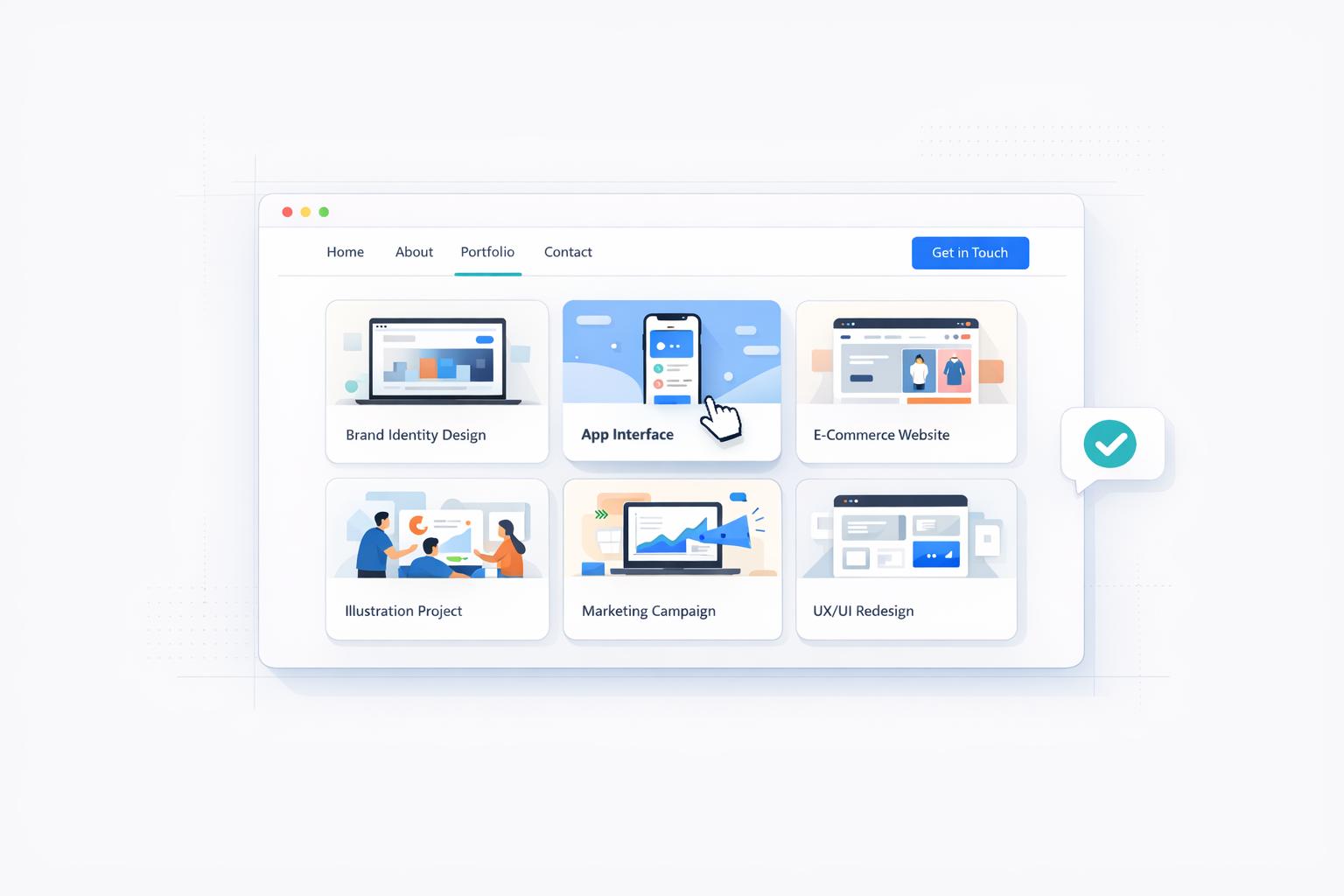
The traditional design portfolio often functions as a catalog: a static collection of projects split into case studies, processes, and metrics. Sers’ approach flips this paradigm entirely. Instead of creating a resume-like static showcase, he designed an immersive experience that reflects his personality, values, and craft.
The homepage, for example, isn’t a series of predictable case study links. Instead, it’s a playground of interactions and curated visuals that invite exploration. "I wanted visitors to feel the level of care and craft, even if they didn’t click on a single case study", Sers explained.
Key takeaway: Think of your portfolio as an interactive experience, not just a repository of projects. Let the portfolio itself become a testament to your creativity.
sbb-itb-32f6eb2
The Art of Subtraction: Less Is More
One of the most striking elements of Sers’ portfolio is how much he intentionally left out. His process began with a brutal editing phase where he cut down his work by 75%, keeping only the pieces that truly raised the bar. Then, he cut that remaining work in half again, showcasing only the absolute best 12-13%.
This commitment to subtraction wasn’t just aesthetic. Sers wanted to avoid creating "surface area for disqualification." A bloated portfolio, he noted, can give hiring managers opportunities to focus on weaker elements, whereas a concise, high-quality showcase leaves a stronger impression.
Key takeaway: Prioritize quality over quantity. Curate your portfolio to include only your strongest work, ensuring that every project serves as a hero piece.
Craft and Microcopy: Obsess Over the Details
Every element of Sers’ portfolio is intentional, down to the wording of his bio. He shared how he spent weeks refining a single introductory paragraph, agonizing over every word. One example he highlighted was the line referencing "12,800% zoom" - a reference that immediately struck a chord with designers familiar with design tools like Photoshop.
This attention to microcopy isn’t mere cleverness; it’s a signal to the right audience. Sers was designing for a specific type of person - a seasoned design manager or experienced designer - who would appreciate such nuances. "It’s specific enough to be meaningful", he explained, "but not so inside baseball that it feels exclusionary."
Key takeaway: Treat microcopy with the same care as visuals. Thoughtful phrasing and word choices can signal shared experiences and resonate deeply with your target audience.
Designing for a Niche Audience
For Sers, a key success factor was knowing exactly who he was designing for. His portfolio wasn’t intended to appeal to everyone; instead, it targeted companies and individuals who value craft and quality - organizations where design isn’t just a function but a core business value.
By focusing on a niche audience, Sers avoided trying to please everyone and instead created something deeply resonant with his ideal hiring managers.
Key takeaway: Identify your target audience and design with them in mind. A focused approach will create a stronger connection than trying to appeal to a broad, generic audience.
The Role of Tools and Iteration
Sers also used the process of building his portfolio as an opportunity to deepen his skills with Framer, a design tool he wanted to master. Instead of prototyping everything in tools like Figma first, he built much of the portfolio directly in Framer, treating the process as both a learning experience and a creative experiment.
From creating intricate animations to developing interactive components, Sers pushed the boundaries of what Framer could do. "I had this blurry idea of what I wanted, and then it was just iterate, iterate, iterate", he explained.
Key takeaway: Use portfolio projects as a means to learn new tools or refine existing skills. The process itself can be as valuable as the final outcome.
Desktop-First Design: A Hot Take
While conventional design wisdom often emphasizes mobile-first design, Sers took a different approach, focusing his portfolio almost exclusively on desktop. He made this decision based on his target audience - design managers and hiring teams - who are statistically more likely to view portfolios on desktop devices.
This approach sparked an important conversation about prioritization. "Don’t limit your creative potential by letting mobile constraints hold you back", Sers argued. While mobile responsiveness is important, Sers chose to allocate his time and energy toward creating a standout experience where it mattered most: desktop.
Key takeaway: Prioritize the primary context in which your audience will engage with your work. If most of your viewers are desktop users, focus your efforts there.
Key Takeaways
- Prioritize Experience Over Functionality: A portfolio should reflect your personality and design philosophy. Go beyond static pages and create an immersive experience.
- Curate Ruthlessly: Showcase only your absolute best work. Remove anything that doesn’t raise the bar to avoid creating "surface area for disqualification."
- Obsess Over Microcopy: Details like phrasing and tone can establish an emotional connection with your audience. Thoughtful word choices matter.
- Know Your Audience: Design for a specific niche or type of company. Trying to appeal to everyone often dilutes your impact.
- Use the Process to Learn: Building a portfolio can double as a chance to master new tools or experiment creatively. Let the journey be as fulfilling as the result.
- Desktop First Isn’t Dead: For specific audiences, desktop-focused design can be more impactful than mobile-first approaches.
- Focus on Craft: Treat every element - interactions, visuals, copy, and animations - with care and intention. The details matter.
Conclusion
Matt Sers’ portfolio is a masterclass in intentionality, craft, and personal expression. By focusing on creating an experience, curating his work to perfection, and targeting a specific audience, he built a portfolio that does more than showcase his skills - it tells a story about who he is as a designer.
For freelancers, creative agencies, and marketing teams, Sers’ process offers invaluable lessons. Whether you’re crafting your own portfolio or helping a team present their work, remember to prioritize quality over quantity, obsess over the details, and design with purpose. In the end, a well-executed portfolio isn’t just a collection of projects - it’s a reflection of your values, skills, and creative vision.
Source: "Matt Sellers - What a top 1% design portfolio looks like" - Dive Club 🤿, YouTube, Jan 1, 1970 - https://www.youtube.com/watch?v=hI1vsPhHAFs