5 Examples of Clear vs Vague Client Feedback
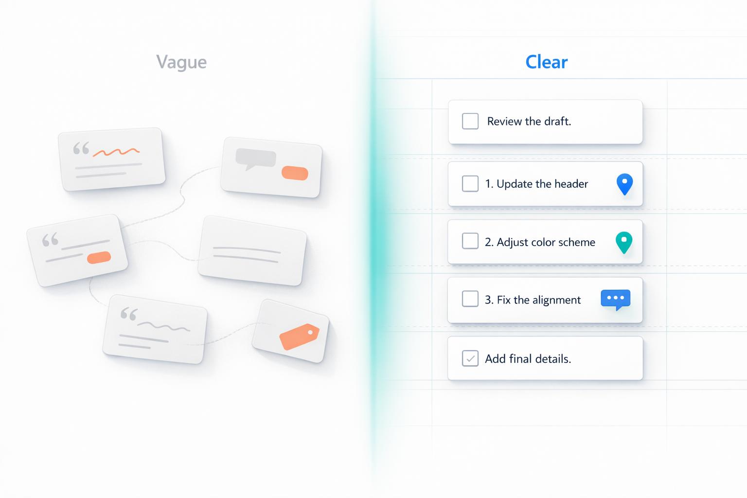
Clear feedback saves time and reduces frustration during creative projects. Vague comments like "Make it pop" or "It doesn't feel right" leave too much room for interpretation, leading to miscommunication and wasted effort. Specific, actionable feedback - like "Use #FF5733 for the button background" or "Move the CTA 20px to the right" - provides clear direction, minimizes revisions, and speeds up project timelines.
Key Takeaways:
- Color Feedback: Replace "Make it pop" with specific color codes or contrast suggestions.
- Layout Feedback: Swap "It looks weird" for precise adjustments like font size or alignment changes.
- Tone Feedback: Clarify "Make it more exciting" by suggesting specific word choices or sentence structures.
- Functionality Feedback: Avoid "It's not user-friendly" and describe exact issues like broken elements or layout problems.
- Overall Design Feedback: Instead of "I don't like it", reference brand guidelines or provide examples.
Quick Comparison:
| Vague Feedback | Clear Feedback | Result |
|---|---|---|
| "Make it pop." | "Use #FF5733 for the button and #FFFFFF for the text." | Faster revisions, no guesswork. |
| "It doesn't feel right." | "Align the image left and center the text below it." | Targeted changes, fewer iterations. |
| "Make it more exciting." | "Use action verbs like 'boost' in the hero section." | Clear path for copy adjustments. |
| "It's not user-friendly." | "Add hover states to navigation links for clarity." | Focused fixes, reduced trial-and-error. |
| "I don't like it." | "Use primary blue (#007BFF) for CTAs and limit images." | Aligned design with brand guidelines. |
Clear feedback transforms vague ideas into actionable instructions, ensuring projects move forward efficiently while improving collaboration.
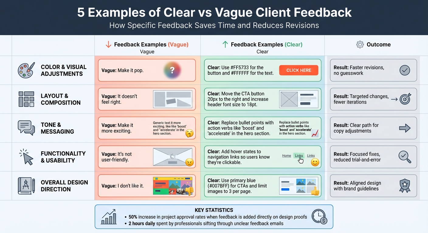
Clear vs Vague Client Feedback: 5 Examples Comparison Chart
Example 1: Color and Visual Adjustments
Vague Feedback
When a client says something like "Make it more modern" or "It needs to pop," it’s a reflection of their instincts rather than actionable instructions. The problem? These phrases mean wildly different things to different people. For one person, "modern" might suggest a sleek, minimalist design. To someone else, it could mean bold neon colors and flashy elements. Without specifics, designers are left guessing, which ultimately slows down the entire process.
"The three worst words a designer can hear: 'Make it pop.' It just doesn't mean anything." – 99designs
Clear Feedback
Now, compare that to feedback like: "Use #FF5733 for the CTA button background and change the text to #FFFFFF for better contrast." This type of direction leaves no room for ambiguity. It tells the designer exactly what to adjust and how. Another example might be: "The current blue is too dark; please use a lighter tint to match our brand guide." Including reference images or examples of the desired style can also be incredibly helpful in aligning expectations.
This kind of clarity makes a huge difference - projects move faster, and revisions are minimized.
Comparison Table
| Vague Feedback | Clear Feedback | Impact on Project |
|---|---|---|
| "Make it pop." | "Increase the contrast of the CTA button using #FF5733." | Eliminates guesswork; reduces revision rounds. |
| "It doesn't feel like a modern aesthetic." | "Use a minimalist layout with clean sans-serif fonts and neutral tones." | Provides clear stylistic direction; speeds up approval. |
| "I don't like the colors." | "The current blue is too dark; please use a lighter tint to match our brand guide." | Offers specific guidance for the next iteration. |
When clients provide exact hex codes, reference images, or detailed notes about specific elements, it streamlines the process. In fact, research shows that adding feedback directly on design proofs can increase project approval rates by up to 50%.
sbb-itb-32f6eb2
Example 2: Layout and Composition
Vague Feedback
When a client says something like "It doesn't feel right" or "Something looks weird," they’re sharing a gut reaction without offering specifics. This leaves designers guessing about potential issues - spacing, font size, alignment, or something else entirely. As ReviewStudio explains, when feedback is overly broad, "the receiver must try to interpret it as best they can with the information available". This guesswork often results in multiple rounds of revisions, with designers addressing the wrong problems and wasting valuable time. A lack of clarity in feedback can derail progress.
Clear Feedback
Clear feedback, on the other hand, eliminates the guesswork. For example: "Move the CTA button 20 pixels to the right and increase the header font size to 18pt." This gives the designer precise direction about what to adjust and how. Another example might be: "Align the hero image to the left and center the text below it." Adding visual annotations, like circling elements or drawing arrows, further ensures that the message is understood without confusion.
Comparison Table
| Vague Feedback | Clear Feedback | Processing Time | Revision Accuracy |
|---|---|---|---|
| "It doesn't feel right." | "Move the CTA button 20px to the right and increase the header font size to 18pt." | Lengthy trial-and-error | Low (requires multiple attempts) |
| "Something looks weird." | "Align the hero image to the left and center the text below it." | Minutes to implement | High (clear and direct instruction) |
The contrast in efficiency is striking. With clear, actionable feedback, designers can make changes in minutes. In contrast, vague comments often lead to frustrating back-and-forth communication. On average, professionals spend about two hours daily sifting through emails to figure out which feedback applies to specific design elements. This highlights just how much time can be saved with precise communication.
Example 3: Tone and Messaging
Vague Feedback
When it comes to tone and messaging, vague feedback can leave copywriters scratching their heads. Phrases like "Make it more exciting" or "This needs more punch" might reflect a gut reaction, but they fail to pinpoint what’s actually missing. Without clear direction, copywriters are left to guess whether the client wants stronger language, a different structure, or something else entirely. This often leads to multiple rounds of revisions that still don’t hit the mark, wasting both time and effort.
"When feedback is too broad, unclear or not properly targeted, the receiver must try to interpret it as best they can with the information available" - Anna Lodwick
Clear Feedback
On the flip side, clear feedback offers actionable suggestions that address specific communication issues. For example:
- Instead of saying "Make it more exciting," try: "Replace bullet points with action verbs like 'boost' and 'accelerate' in the hero section copy."
- Instead of saying "This needs more punch," try: "Break the introduction into shorter, more concise sentences."
- Instead of saying "Make it more strategic," try: "Emphasize financial benefits and connect the solution to broader market trends."
These kinds of instructions give copywriters a focused path to follow.
Comparison Table
| Vague Feedback | Clear Feedback | Result |
|---|---|---|
| "Make it more exciting." | "Replace bullet points with action verbs like 'boost' and 'accelerate' in the hero section copy." | Copywriter knows exactly which words to adjust. |
| "This needs more punch." | "Break the introduction into shorter, more concise sentences." | Provides a clear method to achieve the desired effect. |
| "Make it more strategic." | "Emphasize financial benefits and connect the solution to broader market trends." | Transforms an abstract idea into actionable guidance. |
"The most important word in your feedback is 'because'. It helps me understand exactly what you do/don't like and why" - Bonnie Harrington
When clients take the time to explain why they want certain changes, it eliminates guesswork. A phrase like "exciting" or "punchy" means different things to different people, but when paired with reasoning, it becomes much easier to translate into effective revisions. Just as with comparing feedback tools for visuals or layouts, this approach saves time and improves the quality of the final product.
Example 4: Functionality and Usability
Vague Feedback
When clients say things like "It's not user-friendly" or "Something feels off," they leave the team guessing. These kinds of broad statements don’t specify what’s wrong, making it difficult to pinpoint the problem. Is the issue with navigation? Search functionality? The checkout process? Or maybe mobile responsiveness? Without clarity, developers often waste time on trial-and-error fixes, leading to repeated revisions.
"Vague design feedback doesn't give your designer enough information to move forward... Keeping things vague adds an unnecessary level of guesswork to your design process."
- Tamara Milakovic, 99designs
Clear Feedback
The solution? Be specific. Detailed feedback eliminates ambiguity and ensures the team knows exactly what to address. Instead of saying "It's not user-friendly," try something like:
"Add hover states to the navigation links so users know they're clickable."
If the issue lies with mobile layout, avoid general remarks like "The layout is broken on mobile." Instead, clarify:
"The pricing table columns overlap when the screen width is under 768px."
Similarly, rather than saying "The checkout process is confusing," specify the exact problem:
"The 'Next' button is below the fold on iPhone 13 and should be moved above the payment summary."
This level of precision allows developers to quickly replicate the issue, understand its root cause, and apply a focused fix - saving time and avoiding unnecessary back-and-forth.
Comparison Table
| Vague Feedback | Clear Feedback | Impact on Timeline |
|---|---|---|
| "It's not user-friendly." | "Add hover states to navigation links so users know they're clickable." | Clear: Single revision cycle. Vague: Multiple follow-ups required. |
| "The search bar doesn't work right." | "The search bar fails to return results when using special characters like '&' or '#'." | Clear: Bug replicated instantly. Vague: Hours of guesswork testing. |
| "The checkout process is confusing." | "The 'Next' button is below the fold on iPhone 13; move it above the payment summary." | Clear: Targeted fix implemented. Vague: Repeated rounds of revisions. |
Example 5: Overall Design Direction
Vague Feedback
When it comes to overall design direction, vague feedback can derail progress and lead to unnecessary revisions. For instance, saying something like "I don't like it" is one of the least helpful comments a designer can receive. It provides no actionable guidance and leaves the team guessing. Is the issue with the colors? The fonts? The layout? Or perhaps the imagery? Without clarity, designers are left to interpret the feedback, often reworking elements that weren't the real problem to begin with.
This challenge is tied to what’s often called the "Curse of Knowledge."
"When feedback is too broad, unclear or not properly targeted, the receiver must try to interpret it as best they can with the information available."
- ReviewStudio
To avoid this kind of ambiguity, feedback should be reframed into specific, actionable instructions that align with the brand's vision.
Clear Feedback
The key to effective feedback is translating vague impressions into concrete, design-focused directives. Instead of saying "I don't like it," refer directly to your brand guidelines and provide clear, actionable input. For example: "This design doesn’t align with our brand. Use our primary blue (#007BFF) for all CTAs and limit images to three per page."
If the tone feels off, offer detailed adjustments: "This design feels too playful for our B2B audience. Opt for a minimalist layout with more white space and clean sans-serif fonts, similar to the examples I’ve attached." This level of detail gives designers a clear path forward, reducing guesswork and revision cycles.
The table below highlights how actionable feedback improves outcomes compared to vague comments.
Comparison Table
| Vague Feedback | Clear Feedback | Impact on Timeline |
|---|---|---|
| "I don't like it." | "Use our primary blue (#007BFF) for CTAs and limit images to 3 max per page." | Clear feedback enables targeted changes, while vague feedback leads to guesswork. |
| "Make it pop." | "Increase color contrast on the CTA buttons and use bold typography for headers." | Specific feedback pinpoints tasks; vague feedback risks altering unnecessary elements. |
| "It doesn't feel modern." | "Move toward a minimalist layout with more white space, like the examples provided." | Clear feedback sets visual goals; vague feedback results in subjective misalignment. |
How to Handle Client Feedback [Copywriting Tips for Beginners]
How to Get Clearer Feedback from Clients
Getting specific feedback from clients doesn’t happen by chance. Professionals spend an average of two hours daily trying to untangle email chains, often because of unclear client comments. By using a few proven strategies, you can help clients manage design feedback and revisions so it's precise and actionable. These methods not only simplify revisions but also make the entire process smoother.
Use Feedback Templates
Feedback templates are a great way to guide clients through the process. They prompt them to focus on specific design elements like color choices, layout preferences, messaging tone, and functionality concerns. For example, if a client says, "make it pop", a template can help translate that into actionable steps, such as increasing color contrast or bolding typography. Templates also create a shared "language" that simplifies responses and reduces misunderstandings.
Use Boast for Visual Feedback
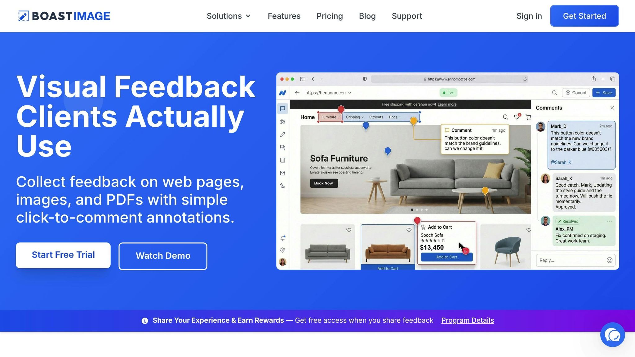
Sometimes, visual tools can clarify things better than words. Boast (boastimage.com) is one such tool that lets clients leave comments directly on specific design elements - like a hero image, navigation bar, or call-to-action button. Clients just click, comment, and they’re done. This eliminates the chaos of scattered feedback across emails and annotated files, which often leads to conflicting instructions. Plus, Boast’s paid plans (starting at $9.95/month for the Solo plan) include unlimited external collaborators, so clients can provide feedback without adding to your costs.
Ask Specific Questions
When clients give feedback that’s too vague, follow up with direct questions to get clarity. For instance, if they say, "it doesn’t feel modern", ask: "Can you share 2-3 examples of websites you find modern?" Or, if they say something feels "off", you can ask: "What specific elements would you like to see changed?". Encouraging clients to share reference images, competitor websites, or examples they like helps turn abstract ideas into actionable steps. This approach transforms the feedback process into a productive dialogue instead of a guessing game.
Set Clear Revision Expectations
Setting expectations upfront can save everyone time and effort. Provide clients with a feedback guide that shows examples of clear, helpful input. After receiving their feedback, recap the discussion with a summary email. For example: "Based on our conversation, we’ll update the color palette to neutral tones with one accent color and reduce the hero image height by 20%." Confirming the agreed changes ensures both you and the client are on the same page before moving forward.
Conclusion
Clear, specific feedback takes the guesswork out of the creative process, saving time and cutting down on frustration. Vague directives like "make it pop" or "it doesn't feel modern" often lead to endless trial-and-error cycles. In contrast, actionable comments - such as "increase the contrast on the call-to-action button" or "reduce the hero image height by 20%" - give teams a clear path forward. This shift toward precise instructions minimizes revision rounds and avoids the burnout that comes from repeated iterations.
Tools that enable clarity in feedback make a noticeable impact. For instance, visual feedback platforms allow clients to comment directly on specific design elements, which can boost project approval rates by as much as 50%. When clients can pin their thoughts to exact parts of a design, there’s far less room for confusion or miscommunication. Boast simplifies this process: clients just click a link, leave their comments right on the design, and they’re done - no need for accounts or logins. It’s straightforward, fast, and effective.
Incorporating feedback templates, asking targeted questions, and using visual tools can transform the revision process. When clients are equipped with a clear framework for providing feedback and the right tools to do so, projects move forward more efficiently, and working relationships improve.
The goal isn’t to overhaul how clients think - it’s about creating a system where clarity becomes the easiest option. With tools like Boast (boastimage.com) - starting at $9.95/month with unlimited external collaborators - you can turn scattered feedback and endless email threads into streamlined workflows with clear, actionable next steps.
FAQs
What details make feedback actionable?
Actionable feedback works best when it’s clear, specific, and directly connected to particular aspects of the work. To make it truly effective, include concrete suggestions or examples that illustrate the desired outcome. This way, there’s no room for misunderstanding, and the person receiving the feedback knows exactly how to act on it.
How do I turn “make it pop” into a clear request?
To better understand what someone means by “make it pop,” try asking for clear, actionable feedback. For instance, you could focus on specific aspects like color, contrast, or layout. Questions to consider include:
- “Which element should draw more attention?”
- “Are you thinking of using brighter colors, stronger contrast, or bolder fonts?”
- “Can you show me an example of what you mean by ‘pop’?”
These kinds of questions can help you pinpoint exactly what they’re envisioning.
What’s the fastest way to collect clear client feedback?
The quickest way to gather clear client feedback is by using structured, visual feedback tools that streamline communication and eliminate confusion. Tools like BoastImage let clients leave detailed comments directly on designs or web pages - no logins or complicated setups needed. On top of that, encouraging clients to provide specific examples or suggestions can transform unclear feedback into actionable input, cutting down on back-and-forth and minimizing revisions.